Users of your site can browse your site effectively without a navigation tool, but they won’t get very far. Designing a solid site navigation tool helps generate more leads, conversions, and improve search rankings. Reorganizing the menu structure is often a time-consuming task, but it significantly enhances user experience and can improve your organic search rankings.
“Navigation” of a website is best understood as the means for users to explore your site. When designing your site, ensuring that people can easily move around should be a top priority. If you design a sleek website without an easy way to explore it, what’s the point?
A site’s navigation should highlight your branding, communicate your company’s values, but most of all, guide users along the yellow-brick road of the buying process. High-level pages typically provide basic information for buyers in the awareness stage. But from there, users travel farther to the land of Oz (or checkout), and the longer they spend on this journey, they’ll consume more pages and more detailed information. Effectively, the navigation tool serves as the path to a better user experience, higher lead generation and increased conversion rates.
Improving search rankings can be a valuable byproduct of a solid navigation tool, but there are a couple of things to consider:
Giving priority to important pages is the easiest, most strategic and effective way to organize your navigation structure. An organized hierarchy allows search engine crawlers to understand the weight each page carries. Moreover, it makes the navigation easier for the user, which Google prioritizes above anything else. If you keep in mind these five considerations, and the potential impact they’ll have, your navigation will strengthen page authority and overall search rankings.
Need a tool for understanding if Google’s robot can crawl your navigation? Use the Fetch as Google tool.
Now that we have an idea of what navigation does, and the ways it can add value. Let’s take a look at a few sites with creative design.
Drop down menus can be an effective navigation tool even though some advise against it. Take Road Runner Sports, for example:
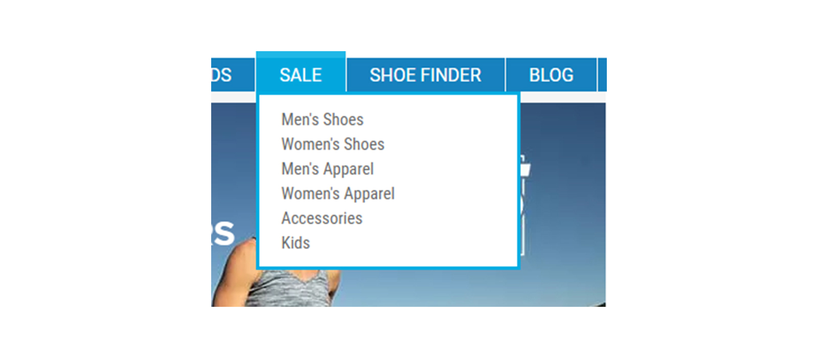
A drop down menu is a great way to add multiple pages in a navigation without feeling spammy. That way, anyone shopping for deals can easily find it on the homepage rather than clicking “men’s shoes,” and then “sale.” It guides visitors down the sales funnel in a more efficient way.
The most important consideration with a larger dropdown is that Googlebot can crawl it. If you are using JavaScript or another non-HTML code base, be sure that all pages are crawled. A great way to see how Googlebot is digesting a site is by looking at your server’s log files. If you see the bot hitting your homepage and then the pages in your navigation, chances are that everything is all set!
Chicago based consumer credit check agency TransUnion keeps its design simple, but effective for anyone to navigate with its tenant screening tool, SmartMove.
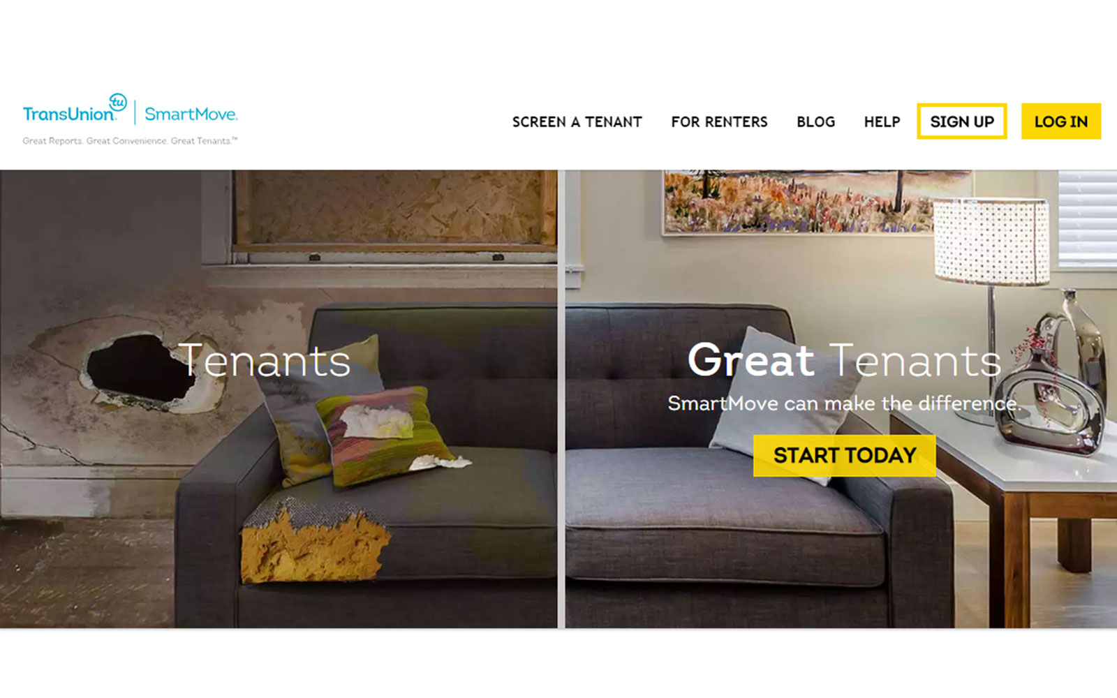
See how they provide the most important pages in the header? But they go the extra mile with their display by giving users a more immersive, interactive tool below, as well. Also notice how the logo is in the top left. Some companies forget to do this even though it should be obvious — the logo should always link to the homepage.
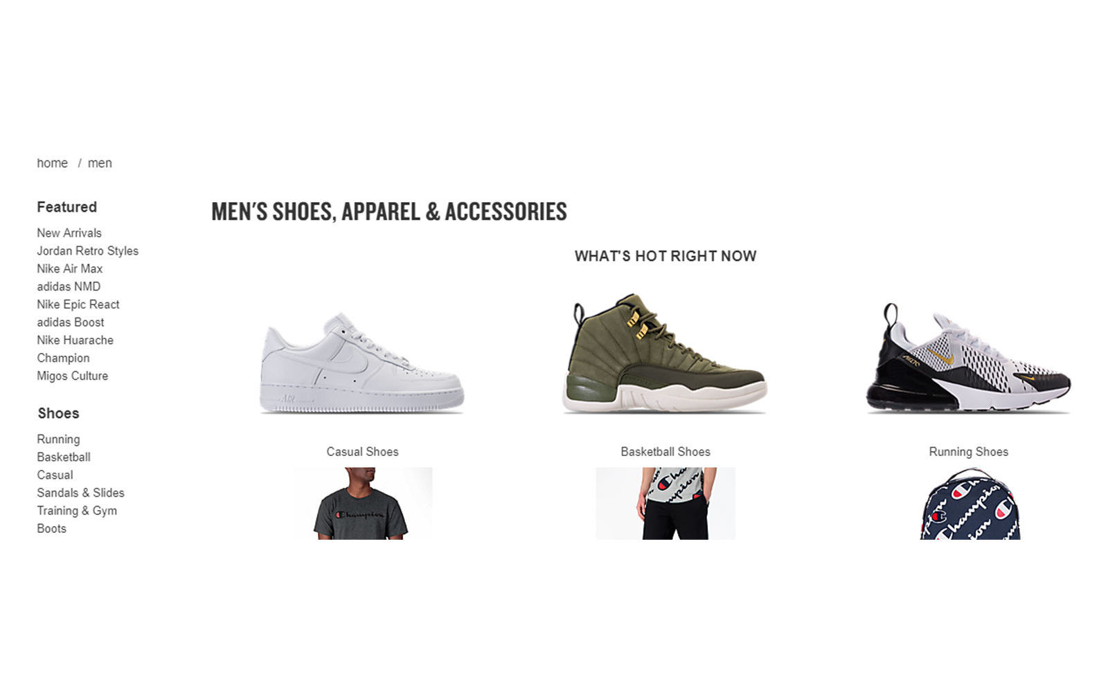
This retail shoe store gives us the perfect window into site navigation that gently leads to lead generation and conversions. On the men’s shoes page, we see a right-rail navigation that provides more detailed information for consumers. Remember, the deeper down the sales funnel the user goes, the more detailed pages become. This allows visitors (and the search engine crawlers) to find exactly what they’re looking for.
Think of your site navigation as the express train of your site. There will be different stops along the way, but the final destination is a conversion. If you keep your site simple, fun and effective, it increases the chances of users reaching that destination. By leveraging the built-in SEO considerations, the overall value can’t be debated.
For more information on website navigation techniques, click here.


